

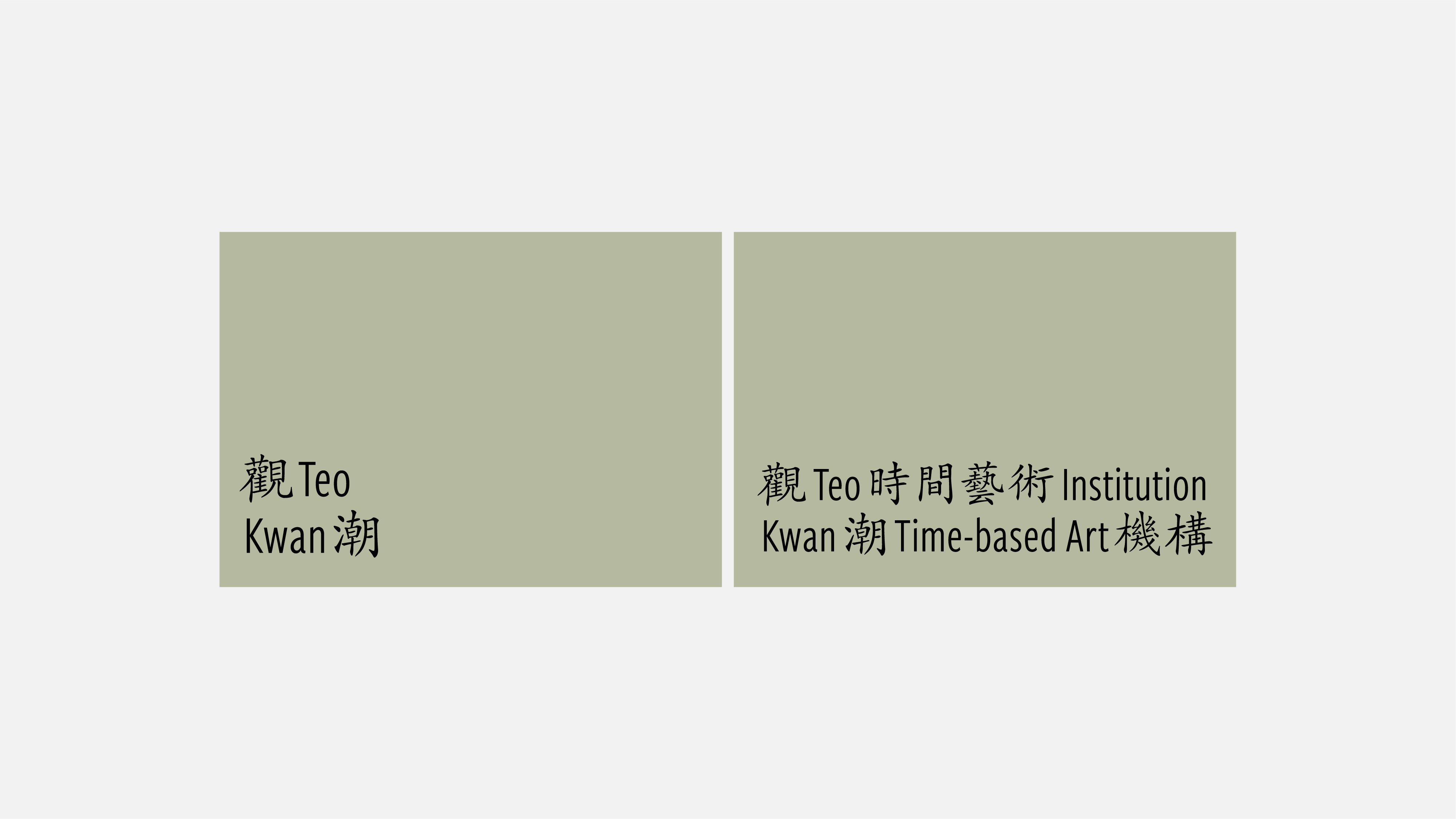
观潮时间艺术机构
Kwanteo Time-based Art Institute
视觉形象 VI
2021
Kwanteo Time-based Art Institute
视觉形象 VI
2021
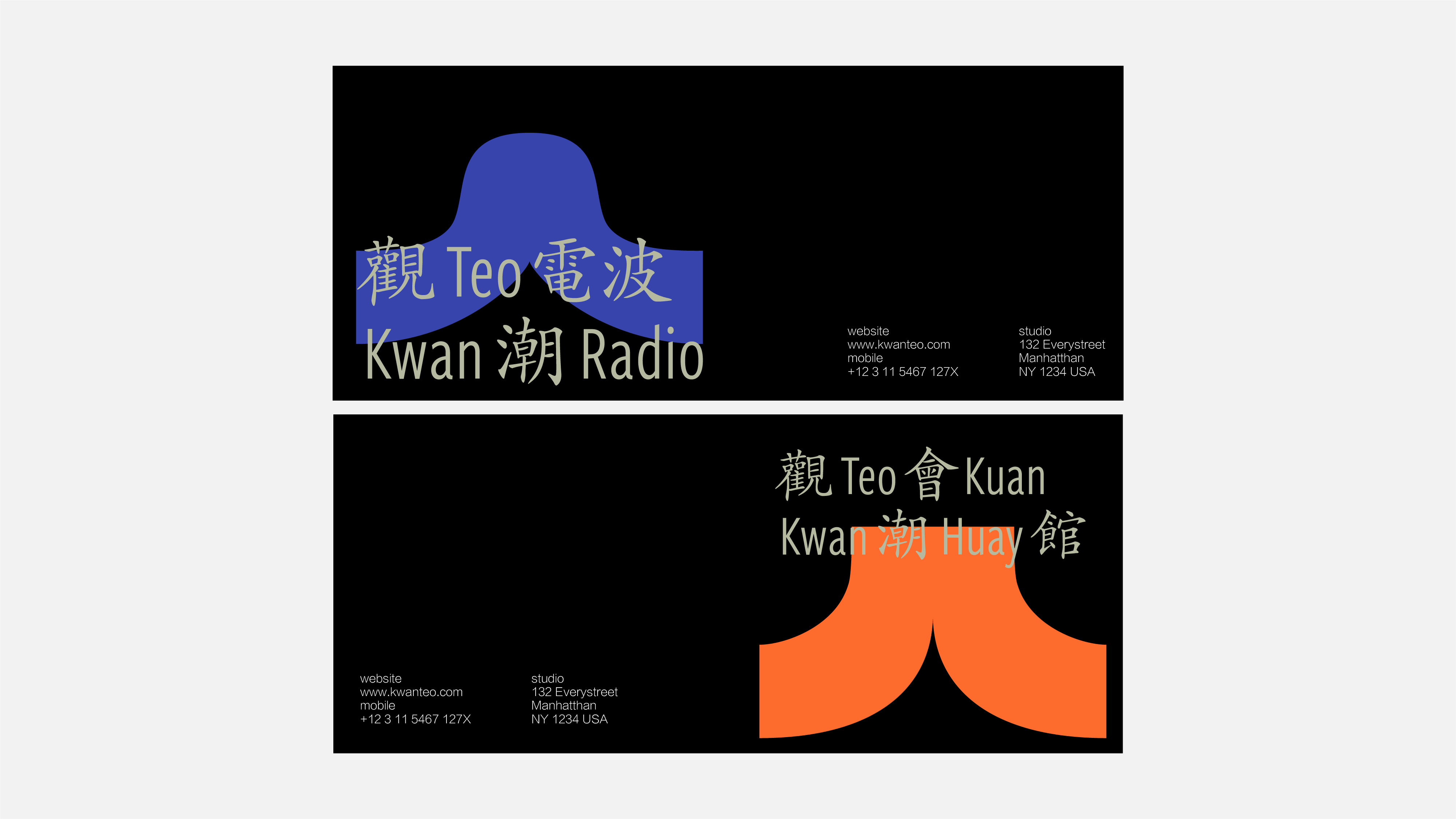
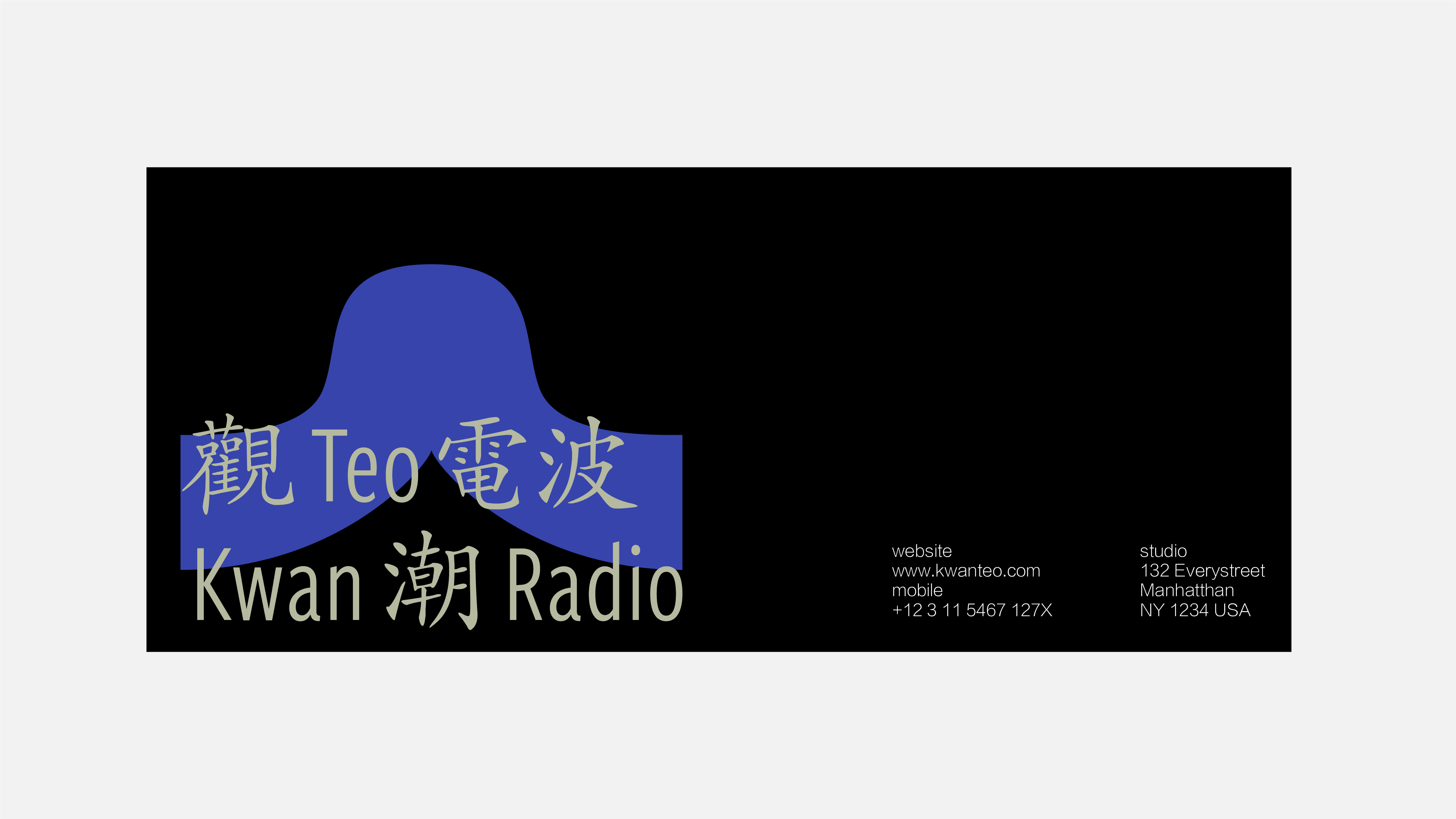
观潮时间艺术机构(简称“观潮”),自2015年创立至今,始终围绕“潮汕”的精神内核和意义外延。旗下有“观潮电波”(播客)以及“观潮会馆”(多功能实体空间)。
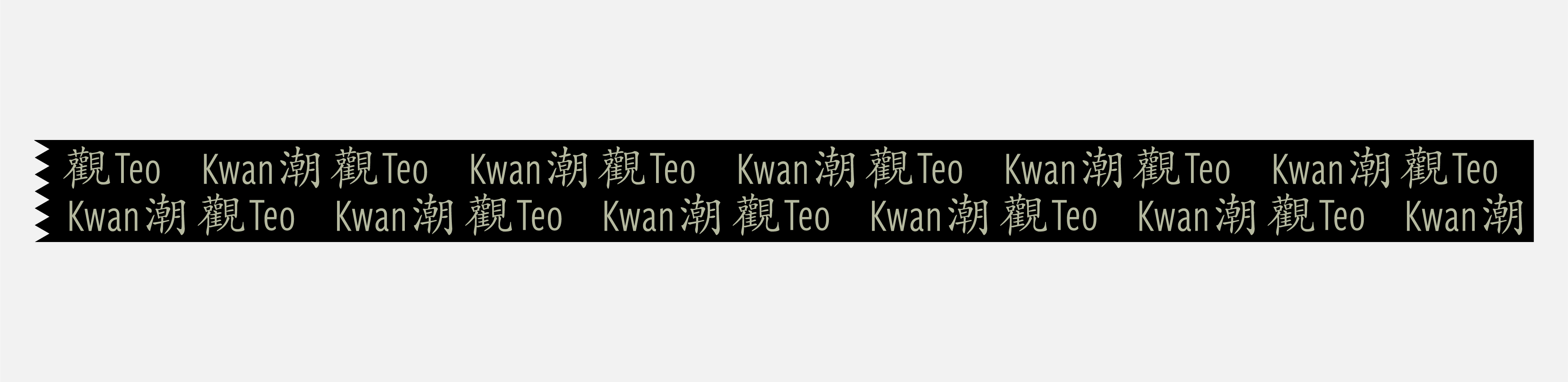
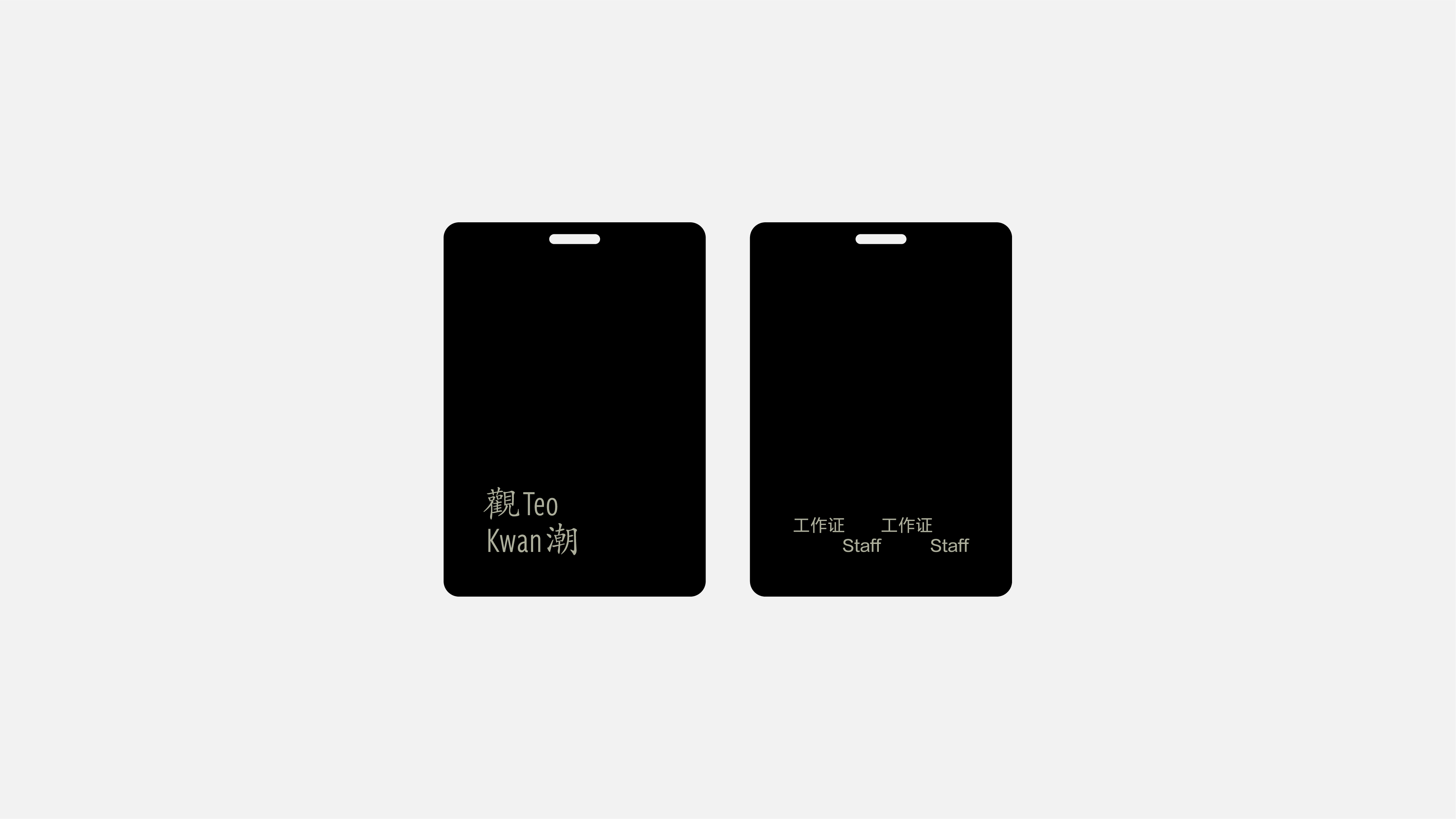
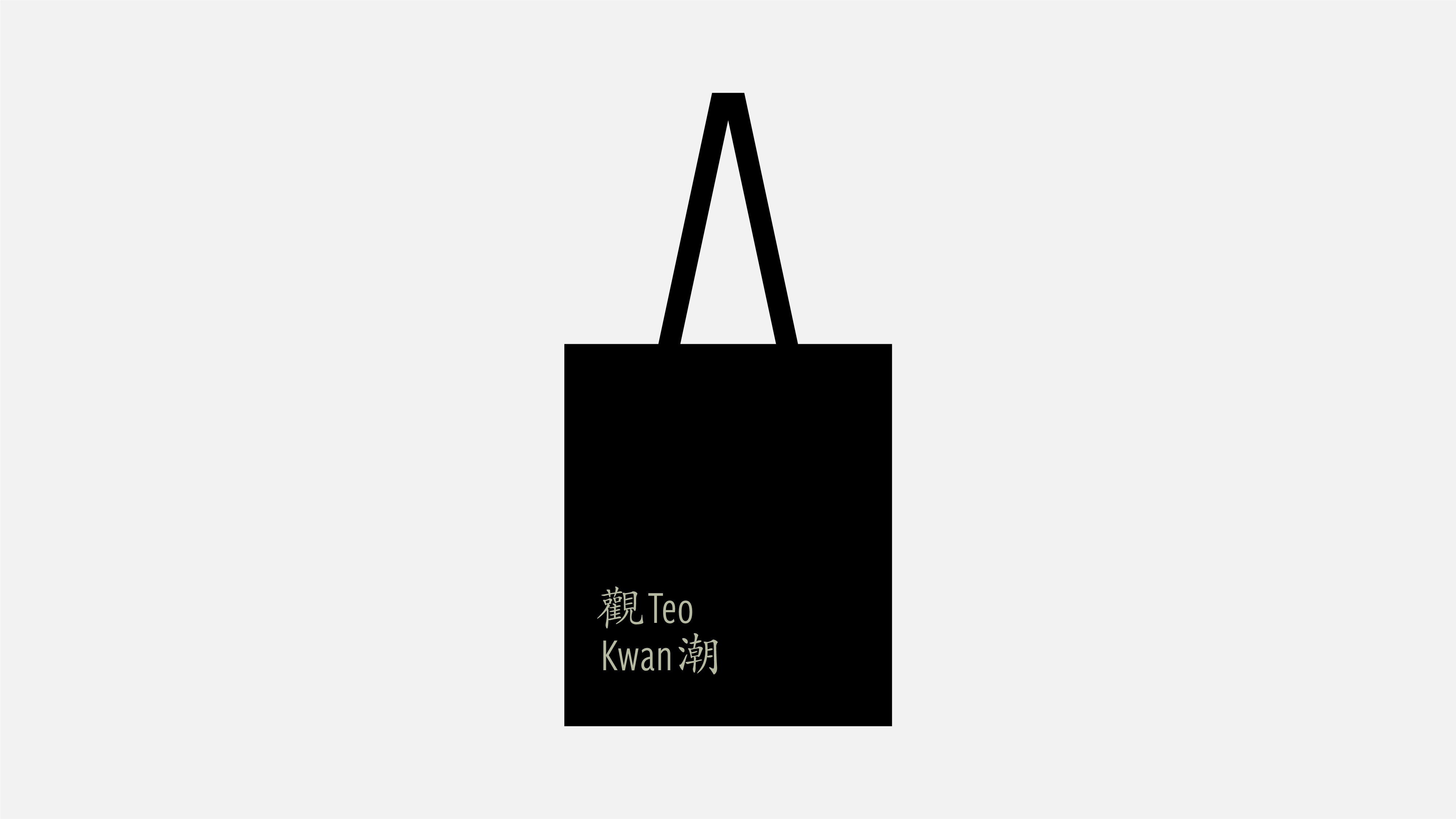
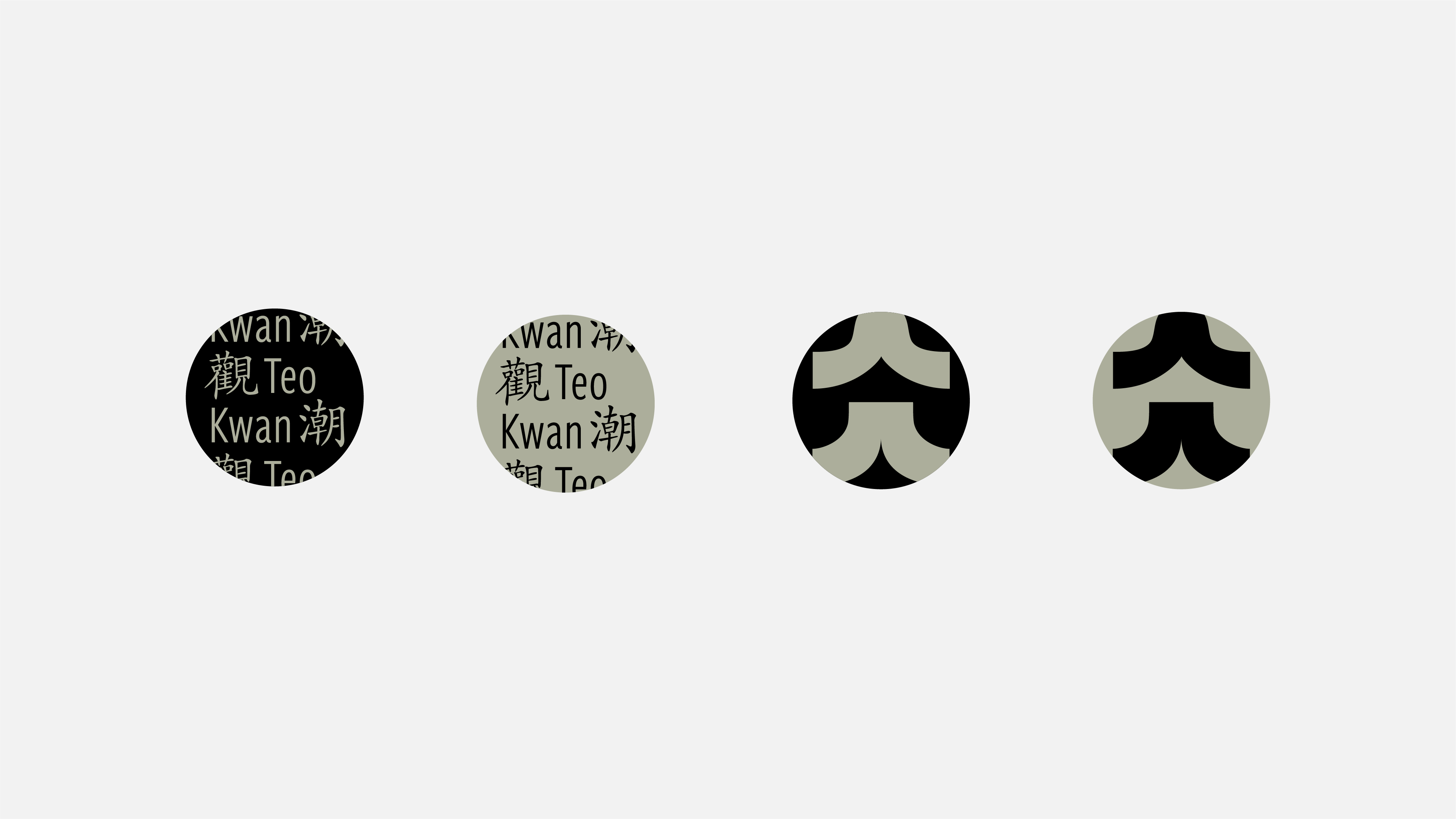
观潮的标识是通过一组简单明了的标识创建的。“观, Kwan, 潮, Teo”作为 logo的核心结构,通过在其后排列上相应的后缀来生成其余的Logo组合。Logo中将中文和英文字体结合交织在一起,这种上下交错的结构产生了视觉动态,这也是潮水的波动一种平面化的体现。
观潮的标识是通过一组简单明了的标识创建的。“观, Kwan, 潮, Teo”作为 logo的核心结构,通过在其后排列上相应的后缀来生成其余的Logo组合。Logo中将中文和英文字体结合交织在一起,这种上下交错的结构产生了视觉动态,这也是潮水的波动一种平面化的体现。
Kwanteo Time-based Art Institute, established in 2015, has always focused on the spiritual core and meaning extension of “Chaoshan”. Kwanteo Radio and Kwanteo Huay Kuan are different programs run by Kwanteo.
The identity of Kwanteo was designed based on a set of simple and straightforward logotype. “观, Kwan, 潮, Teo”, was the core structure of the logotype. To add different postfix after the core structure could generate the rest of logo lockups. The logo combined and interlaced Chinese characters with English words together. This staggered and knitted structure generated an eye movement, and it also represented waving tidewater.
The identity of Kwanteo was designed based on a set of simple and straightforward logotype. “观, Kwan, 潮, Teo”, was the core structure of the logotype. To add different postfix after the core structure could generate the rest of logo lockups. The logo combined and interlaced Chinese characters with English words together. This staggered and knitted structure generated an eye movement, and it also represented waving tidewater.